Posts Tagged ‘HTML’

Migration to WordPress.

Sunday, January 24th, 2010

Since I got the job to set up a blog for someone else, and since it was decided that the blog should be done with WordPress, I started to play around with this blogging package a few days ago. To learn how to set things up and make modifications, I tried to replicate the style of my own blog, which is based on the very simple blosxom. One thing came to another and finally I tried to import all of my blosxom blog entries into the new WordPress database – and here we are! I decided to switch to WordPress because:

  • it is maintained much more regularly,
  • it is much more comfortable to use,
  • it offers more and more useful plugins,
  • I hope it will make it easier to keep off spam,
  • it finally allowed me to make a tag cloud.

The latter can be marvelled at to the right. I am quite baffled at how closely the tag cloud represents those aspects of my life that I put into this blog in the course of the last six years. It will be interesting to see how the cloud develops in the future…

I decided against keeping the content in the same address location because of the cryptic cgi blabla that was part of the old address. Therefore I would like to ask you to update your bookmarks and feed readers to go to the new address: http://userpage.fu-berlin.de/frers/blog.

Upgrading video on website to HTML 5.

Monday, October 5th, 2009

In the course of the last month I have recoded all of my pages with video content to conform to the current working draft of HTML 5. The nice thing is that there already is a code validator for HTML 5, so that I found some things that have changed from HTML 4 to 5 that I would have overlooked. (For example the fact that the <acronym> tag isn’t part of the standard anymore and that <abbr> should be used instead.)
The main reason for me to switch to HTML 5 was the new <video> element. Until now, I have used different hacks to embed video into the website without breaking standard conformance or having to use Flash. Or I have used the official standard implementation, which left users of Internet Explorer in the cold anyway. So I was never really content with the way that I offer video because it would either be really hackish code, or it would not validate, or it would break in one or another browser. (Opera for example did not allow some of the officially validating hacks to work…) So now I am using clear and clean HTML 5 code. The only obstacle that I had to overcome was to get Firefox to display the video. I thought this wouldn’t be a problem since Firefox officially supports the video tag beginning with version 3.5. The first code that I wrote looked something like this:

<video controls src="passage.mp4">
<a href="passage.mp4" title="right click to download the file">video file (24 MB)</a>
</video>

This worked perfectly fine in Safari (version 4), but in Firefox I would only get a grey field with an X where the video should be. I did not mind at first, since I was happy to get things running, my code was validating and it was built on an example that I found on the pages of the W3C itself. After a few days, I was bothered by this solution, since about half of the visitors of my website use Firefox and I certainly did not want them to be left in the cold. So I searched a bit and finally found the corresponding bugs on Mozilla’s website (435298 for the Mac and 435339 for Windows) and a general discussion of the issue. In all of these places, the Firefox developers clearly state that they won’t be supporting MPEG codecs and also won’t hook the video element up with the plugin architecture of the respective OSs. Instead, Firefox is implementing the open source Ogg Theora video codec that is not plagued by licensing issues in the way the MPEG-4 codecs are. (There is a pretty thorough discussion about this on Ars Technica.) Well, I never used Ogg stuff for anything so far, but I read that the quality of their video compression improved greatly over the course of the last year. It is open source, which I like, and Mozilla decided to try to push it, so I finally decided to give it a shot. Of course, offering embedded video support to all my visitors using Firefox was a pretty big incentive too… After a lot of experimenting, fiddling around with different encoder settings and comparing encoding results with QuickTime X’s h264 encoded files, it became clear, that the quality of Theora is indeed worse than what h264/mp4 offers, but that it is still certainly good enough for presenting video on my website – only very few people will notice the difference between the two formats (but they will notice that the .ogg files are bigger).

I had to change the code a bit to offer both video formats. I chose to use Ogg Theora as the fallback format because of the better quality (smaller size at same quality) of the h264 encoding. My current implementation looks like this:

<video controls>
<source src="passage.mp4" type="video/mp4">
<source src="passage.ogg" type="video/ogg">
Video file: <a href="passage.mp4" title="right click to download the file">MP4/.264 (24 MB)</a> | <a href="passage.ogg" title="right click to download the file">Ogg Theora (47 MB)</a>
</video>

This way, Firefox 3.5 and Safari 4 show the embedded video with controls, while all other browsers (I tested Camino 1.6, Opera 9 and 10, and Internet Explorer 7 and 8) fall back to displaying the direct links to the video files. After doing some more testing, I must say that I prefer Firefox’s implementation of the video element to Safari’s, because Firefox will only download the video file when it is actually activated by the user, whereas Safari will start the download of all embedded video files immediately, thus clogging my internet connection as soon as I open the website.

If you want to check out how I implemented things, you can visit this page, where I also used HTML 5’s new <audio> element: Pacification by Design.
Bye bye, Internet Explorer 6.

Sunday, August 2nd, 2009

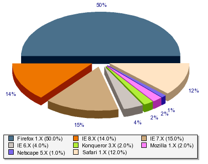
pie chart displaying browser distributionWell, it is more than five years ago that I blogged about the fading away of people using Netscape Navigator 4.x versions to visit my website, a year later about the reduction in people browsing my site with Internet Explorer 5.x and about the first sightings of Internet Explorer 7.
Today things are different, and Microsoft’s Internet Explorer 6.x is the beast that keeps me from implementing cleaner HTML code for this website. But there are good news: In the last months, the number of people visiting this site with Internet Explorer 6.x has more and more often been smaller than the number of users browsing the web with the current 8.x incarnation of the beast. This is good news, because the new version 8.x is much more standards compliant and it finally, finally supports the use of the quote tag <q>. That means that more people will acutally see the quotation marks around the quotes (“” for English, „“ for German) that I coded into this blog and the other pages offered here.
When the amount of IE 6.x users consistently remains below three percent, I will kick out the hacks that I put into the code to work around IE 6.x’s annoyances. Maybe that will also be the day when I will introduce the first pages that are coded in HTML 5, something that I am really looking forward to because the new <video> element will make embedding video in a standards conformant way much easier.

Einbalsamierung mal anders.

Wednesday, July 5th, 2006

Es ist geschafft. Anlässlich des Auslaufens unseres Graduiertenkollegs haben Reinhard und ich die Webseiten des Kollegs überarbeitet und in einen Zustand überführt, in dem sie den Zustand des Kollegs an seinem Ende für die Nachwelt erhalten – sie wurde gleisam mit standardkonformem XHTML 1.0 Code einbalsamiert. Mumien im Internet. Eine politisch korrekte Mumie, denn sie genügt auch noch recht vielen Kriterien der Barrierefreiheit. Das Antlitz dieser Mumie soll also nicht abschreckend, sondern eher eine Fundgrube für weitere Untersuchungen sein – es sind keine Labors oder Computertomografien notwendig, um sich das Innenleben der Mumie zu erschließen. Ein paar Klicks genügen.

Good deeds.

Saturday, October 29th, 2005

A month ago, I changed the CSS code for the online version of my diploma thesis, introducing separate style definitions for printing. Yesterday, I also wrote a style sheet for the rest of my website – excluding home page and blog, on which I will work later. Printing should be even more fun now. Making the changes was pretty easy, since I could use most of the template that I made for the diploma thesis part of my website.

At this point, we are in the good deed singular stage. What’s up with the plural? Well, after reading about the cash crisis for quake helicopters on BBC, I remembered that I wanted to donate money for the tsunami relief effort last year. Actually, I kind of did not donate last year. Money seems much scarcer for this disaster, and this together with my bad conscience from last year encouraged me to do now what I wanted to do last year. (There are a few donation related links in the article.)

Multimedia ahoy.

Sunday, October 23rd, 2005

Frers Productions is proud to present: Perception, Aesthetics and Envelopment a video recording and the outline of my talk at our post-graduate college’s concluding conference. Thanks to Lars Meier for recording it – and of course for co-hosting the session, thanks to the rest of the grandiose organization team of the conference and thanks of course to the other participants of the Larses’ panel Urban Spaces and Private Quarters for a good and constructive discussion.

I was made aware of a two people who developed similar ideas to the concept of envelopment: Georg Simmel (could have thought of that myself, since I read and even lectured about the relevant essay on Die Großstädte und das Geistesleben several times. The other hint was on the term personal bubbles which seems to be used quite frequently in the anglo-american world – I am still looking for more info on this term, but it seems that it carries some different connotations. Furthermore, I don’t think of the envelope as something that can burst or pop like a bubble. It is more like a field or sphere or a ball of cotton. Nonetheless, good to know about it. Another idea came back to me later: Richard Sennett, of course, has also talked about a sphere of comfort that is produced in city of today in the book that still has the most pivotal influence on my current work: Flesh and Stone.

Back to the title: I have embedded the video into the new page using valid XHTML code without any fiddling & CSS tricksing. That means that the embedded video won’t be displayed in all browsers though. I would be very happy to hear about the cases where it does / doesn’t work – please write a comment (if you have been a lurker until today: you can write a comment by clicking on the ‘x notes’ link below) and tell me about it. In case the embedded stuff does not work, one can just download the .mp4 file and then play it. I would like to hear about the minimum requirements for playing this, too (for example, I have no idea what version of Windows Media Player is required for playing this file).

Printing pleasure.

Tuesday, September 27th, 2005

While I was on vacation in France this summer I printed Wikipedia content for the first time. And boy was I pleasantly surprised. The print had a different layout than the website. It was perfectly suited to reading on a piece of paper, had the aduquate kind of information and ditched web-specific layout aspects. Very nice and all that without having to click on some kind of go here to see the printer friendly version link.

Of course, I wanted to implement this for my website too. Behind the scenes, this is based on good CSS code, which offers hooks to change layout and other features of your content according to the media that is used to access the content on your page (i.e. screens, printed paper, sound, braille thingies for blind people, mobile phones etc.). I knew about this almost since my first dabblings in CSS, but I never collected enough guts to actually write the code for my site.
This changed today – because I was procrastrinating, trying to evade working on a paper that I have to finish very soon, and because of mentioning this feature of CSS to Tini a few days ago, I wanted to see how hard it is to implement. Thanks to SELFHTML and a bit of browsing I was able to hack the changes that are necessary to have a separate print version of my diploma thesis in about four hours – even though the thesis consists of about fourteen separate pages, includes lots of different links, pictures, edits and so forth. Quite a bit less time than I would have feared, I have to admit. I will let this settle for a bit and then implement the same changes for my other pages, which should not take more than an hour – the blog is still waiting for a general code overhaul anyway, during which I will include a print style sheet.
One thing did not work as intended though: the @page part of the CSS 2 specification is not fully implemented by the different modern browsers (we’re not talking Internet Explorer here anyway), therefore the page margins will be different and not always perfect when printing with different browsers. However, I don’t care about this much at this point of time – hopefully these printing features will be implemented sooner rather than later. Here, you can help: vote for the relevant Mozilla bugs 115199 and 286443 in bugzilla!

The beast in decline.

Friday, May 27th, 2005

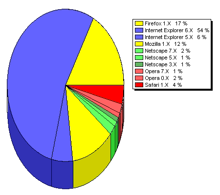
browser share for May 25th 2005 as shown by my SiteMeter statisticsOn the diagram you can see a pretty average distribution of browsers visiting my site. Since the free account at SiteMeter only includes browser share statistics for the last 100 visits the variation can be pretty big. Firefox’s share has been increasing over the last few months, although it has been hovering around 20% for the last two months or so. The development which I watch most closely these days is the percentage of Internet Explorer 5.x users that are visiting this site. This has been steadily decreasing and is usually below 10%. What is even better: more than half of the IE 5.x share consists of Mac Internet Explorer versions that are much, much better at rendering according to standards (that is, their Tasman rendering engine keeps up with most of the CSS Level 1 code that I throw at it). This makes the actual share of Windows IE 5.x – a.k.a. the beast – using visitors something below 5%. That in turn means that I will soon stop supporting this browser and rely more heavily on using modern CSS to manage the layout of my page. I did a similar thing when I dropped support for Netscape 4.x versions several months ago. However, in that case I waited until the Netscape 4.x share dropped below 1%. Why do I handle things differently for Win IE 5.x and start dropping support at a share of about 5%? Because windows machines that are able to run IE 5.x are able to run Firefox well enough too. And they should run it because of the tons of security holes that are opened by browsing the web with this hideous beast of a browser.
The new background image in the main column of this blog is one visible step in the direction redesign and recoding will take – most of the work will remain invisible to those browsing the site. However, that work will enhance accessibility and standards compliance (and propably the search engine ranking too).

Finally a custom favicon.

Tuesday, May 24th, 2005

Beginning with tomorrow’s nightly build my favorite web browser, Camino, will finally support displaying non-root-level favicons such as the one used for my homepage. Favicon? Yup. Favicons are the little icons displayed by all decent browsers in their respective address bars to the left of the web address.
To greet this change in an adequate way I have changed the code for my blog to support my custom favicon in the blog too. Hope you like it, even though I am totally not a designer.

It is not easy to be compliant.

Saturday, February 12th, 2005

Dear readers, I must ask you to bear with me in this time of mishaps: a few days ago I changed the way my blog is delivered to your browser – at least if it is a standards compliant browser. Now, this weblog is being delivered with the correct MIME type of application/xhtml+xml, instead of being delivered with the type text/html that is appropriate for mere old-fashioned HTML.
The side effect of doing this is that browsers of the Gecko familiy (Mozilla, Firefox, Camino, etc.) only render this page if the underlying code is 100% correct. Not a single small error is permitted. If the browser encounters such an error, you will see a short description of the error in the browser window. May I ask you to send me a quick note describing where you encountered what kind of error? Just like Christian (M.D.) – always an example to the rest of us – did today.

From XHTML 1.1 to 1.0.

Sunday, October 17th, 2004

Yesterday the World Wide Web Consortium published a working draft called Specifying the Language of Content, after reading it I finally decided to change some of my pages from being coded according the the XHTML 1.1 standard to XHTML 1.0 Strict. I did this because of accesibility reasons: In XHTML 1.1 it is only allowed to specify the language of your content by using the xml:lang attribute.
The problem with this attribute is that most browsers (with the exception of Opera, I think) do only interpret the xml:lang attribute when the document is served as an XML document with a MIME type such as application/xhtml+xml (a way to accomplish this on my server is using the file suffix .xhtml instead of .html). The problem with serving pages as XHTML pages as XML is that in most cases the layout doesn’t work anymore.
However, most browsers, screenreaders, etc. can handle the lang attribute which is a valid attribute in XTHML 1.0. Therefore I switched. As recommended I am now using both the xml:lang and the lang attributes to declare the text’s language. This has the additional pleasant side effect that quotes are now automatically displayed according to the respective language’s standards. Not by Internet Explorer though, which doesn’t handle the quote element at all. Which is another reason to Browse Happy logo.

New entry page.

Tuesday, September 7th, 2004

On the way to my brother’s wedding I’ve been recoding the root page of my site. It was one of the first page I ever made, and it’s biggest problems were accessibility and manageability because it was based on a table for layout purposes. Until last weekend I only made minor enhancements, but now I have completely dropped the old code and begun from scratch, only keeping the content. I have waited to do the redesign until the percentage of people using Netscape 4.x browsers dropped well under one percent, so that I can rely on recent web standards and extensively use CSS for layout purposes. Not supporting Netscape 4.x versions may seem as if I erected a barrier, however, dropping support for this browser dinosaur actually tears down other, more significant barriers: it makes the page more accessible for people using screenreaders, PDAs and so forth.

The only thing about which I am not at all sure so far is the design of the page. It is functional and not exactly ugly, but it is also a bit boring… However, using CSS the design of the site can be modified without changing the HTML code of the site, as is most wonderfully demonstrated in the css Zen Garden.

Any feedback about the new code and the new design is very welcome!

old page | new page | new style sheet

Creating a commons.

Wednesday, July 7th, 2004

Today, I finished updating all my pages so that their use is regulated by the Creative Commons License. Again, I encourage you to inform yourself about this project, for example by checking out this small explanatory comic.
In addition, I also reworked some of the code that I’ve been using on my pages. Now it is, of course, even more up-to-date, more accessible (Triple-A conformity almost everywhere) and less cluttered. I especially enhanced the CSS code, because I finally got myself acquainted with the properties of nested CSS.

Code overhaul.

Tuesday, March 30th, 2004

This blog is now written in XHTML 1.0 Transitional. Which should be an invisible change except for the different W3C badge in the column to the right. Another change is much more visible: during the overhaul I realized that the default font size for the blog was set to 10 pixels. I changed it to a relative setting and made it a bit bigger (still set to the value “small” though) – this should increase readability and reduce everbody’s squinting at the screen, though it might not be as pretty as the old setting.

Triple-A is too much.

Friday, March 26th, 2004

Today I read my way through the current working draft of the Web Content Accessibility Guidelines 2.0 and decided that I won’t be able to invest the time and effort to conform to the upcoming guidelines sufficiently to ever claim triple-A conformance. However, they clarified the conditions necessitating a sitemap (yay!): documents greater than 50,000 words or sites larger than 50 perceived pages. They admit that this isn’t a very clear requirement: What’s a perceived page? What if it’s a voice XML application? How does it apply to Web applications? Why 50 and 50,000? – but it’s good enough for me.

To sitemap or not to sitemap.

Wednesday, March 24th, 2004

A while ago, I noticed that the World Wide Web Consortium does not only offer Web Content Accessibility Guidelines – it also offers these nice logos for the three different levels of conformance. After reading the guidelines it seemed to me that the only criterion that the post-graduate college’s page (which I designed) does not completely comply with is checkpoint 13.3, because it doesn’t offer a sitemap or table of contents. Since I have this weird urge to get the best W3C accessibility badge available I started to read a bit about sitemap design. I quickly realized that there is not nearly as much literature on this topic to be found as I would have thought. So I read what I found and started to think, draw a few basic designs, and hack some CSS code to display the stuff in a map-ish way without relying on a static picture or tables. After investing quite a bit of time into the whole issue, I realized that it just doesn’t make sense to produce a sitemap for a site that does not have any real complexity. The few sections that are available can be navigated to on every page via the navigation bar, and the if there are further links in the respective section they are all available from that page. Looking at these facts, I decided that the site does fully comply to section 13 as it is, because navigating this site would only be made more complex if I add a mostly redundant sitemap or table of contents. *eyes WAI AAA badge eagerly*

When will the day come?

Wednesday, February 25th, 2004

It is not to be believed. It is nerve-wracking. I’ve put my diploma thesis online two years ago – since then the percentage of people visiting my site with the dreaded Netscape Navigator 4.x versions has not really declined. (Navigator 4.x dreaded? Why? Check these links if you want to know more: for people who know html, for Germans who are interested.)
In the beginning the percentage of Navigator 4.x users was hovering about four to eight percent. These days it may still reach 3 percent. This is just so utterly frustrating since I don’t want to introduce the more interesting features offered by CSS if they break the browsing experience for a significant amount of visitors; especially if those visitors are marginalized because of their hardware/software combination anyway. Not everybody has access even to a Pentium II 300 Mhz upward machine on which Windows 98 SE and Internet Explorer 5.x is installed. However, seeing the technological conservatism of many academic internet users, it seems to be likely that many people are browsing with Navigator 4.x versions because that is the browser which introduced them to the internet, and they don’t want to change the way they access the net. *sighs* Please spread modern browser evangelism and help people install browser that are more modern that Netscape Navigator/Communicator 4.x or Internet Explorer 4.x! Of course, I do recommend the browser developed by the open source community such as the Mozilla family.

Do the XHTML.

Tuesday, November 18th, 2003

Hah. I did it. After reading an encouraging article in the c’t (issue number 23) two weeks ago, I decided to update my website to the XHTML 1.1 standard as recommended by the World Wide Web Consortium. I also changed my own pages to relative size definitions (no px sizes anymore, instead I am now using ems and percentages all over the place). I am quite proud of this. I did not update my start page since I really like the layout and I do not want de-table and change it yet…

It’s about technology, isn’t it?

Wednesday, November 12th, 2003

Many people would say that an institution that is concerned with technology and research should represent itself in a technologically adequate way. I agree. That is the explanation I like to present for what I did yesterday and the day before: changing the code of our post-graduate college’s website to be based on the current W3C standard and successor of HTML, XHTML version 1.1.

Another explanation would be: I want to avoid getting into my own project by doctoring around with other stuff…

Improved layout.

Wednesday, October 29th, 2003

That was a surprisingly easy solution: On the Post-Graduate College’s homepage that I coded one sometimes had more than one scrollbar to navigate the contents of a page – which was pretty confusing. After setting up the page and doing the initial corrections and adaptations I was not especially eager to do even more work on this page so this issue has been lingering for some time. But not anymore! It was an easy fix, I just had to change the overflow attribute of the div elements that I was using to format the layout: I had set them to auto, putting trust into the browser’s abilities to do the right thing; now I changed it to visible and the additional scrollbars disappeared.