Compositional data is a special type of of non-negative data, which carries the relevant information in the ratios between the variables rather than in the actual data values. The individual parts of the composition are called components or parts. Each component has an amount, representing its importance within the whole. The sum over the amounts of all components is called the total amount, and portions are the individual amounts divided by this total amount (van den Boogaart and Tolosana-Delgado 2013).
The great challenge of compositional data is that no single component can be regarded as independent from other. This means, if you observe a (e.g. spatial or temporal) pattern within one single component, at least parts of the pattern is likely rather attributed to another part of the composition than the (spatial or temporal) behaviour of the varibale of interest it self.
Imagine two measurements of a 2-part composition which sum up to a whole:
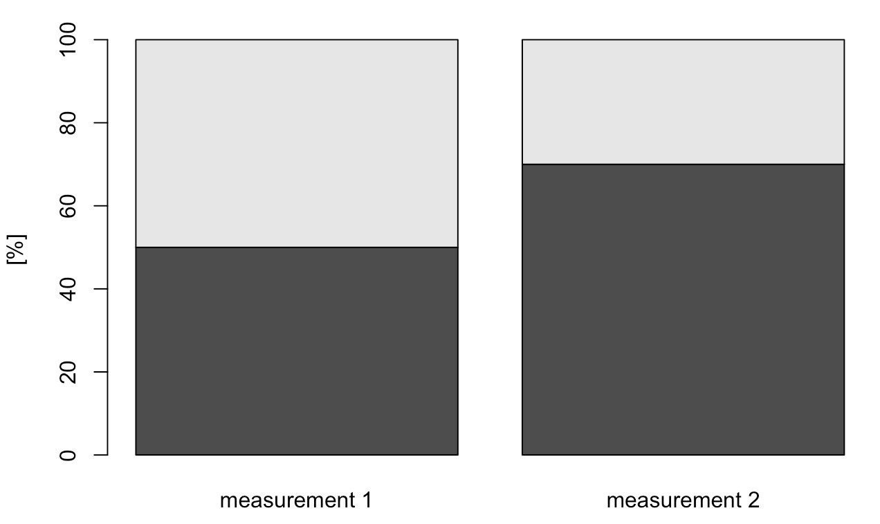
Within measurement 1, both parts are uniform with exact 50% of the whole composition. Measurement 2 is showing up with 70% of the dark gray component and 30% the light grey one. How can we describe the difference:
Has the dark grey component increased whereas the light grey remained constant or has the light grey component decreased and the dark grey remained constant?
It is absolutely impossible to decide what has happened, because both cases would show up with a similar pattern. Furthermore, we have to consider that all values are strictly positive and thus, differences are rather related to ratios than for distances. Thus, we may state the rates of changes by $x=darkgrey$ and $y=lightgrey$:
$$dx=\frac{x_2}{x_1}=\frac{0.7}{0.5}=1.4 \\
dy=\frac{y_2}{y_1}=\frac{0.3}{0.5}=0.6$$
Hence, 40% of the lightgrey part has been shifted to the dark grey, but we still cannot decide whether x increased or y decreased.
Imagine you are on a small hallig in the German wadden sea for a wile, let's say two weeks holidays. There is absolutly nothing to do but counting boats passing by. You are concentrationg on two types of boats: fisher boats and ferry boats.
Here are the results of your counting after 10 days:
import pandas as pd
data = {'day': [1,2,3,4,5,6,7,8,9,10],'fisher boat': [10,10,10,11,11,13,12,2,9,7], 'ferries': [11,11,11,11,11,11,11,11,11,11]}
df = pd.DataFrame(data=data)
df.head()
day | fisher boat | ferries | |
---|---|---|---|
0 | 1 | 10 | 11 |
1 | 2 | 10 | 11 |
2 | 3 | 10 | 11 |
3 | 4 | 11 | 11 |
4 | 5 | 11 | 11 |
df['rel. ferry'] = 100* df['ferries']/(df['ferries']+df['fisher boat'])
df['rel. fisher'] = 100* df['fisher boat']/(df['ferries']+df['fisher boat'])
# First, let's import the needed libraries.
import matplotlib.pyplot as plt
import numpy as np
import seaborn as sns
sns.set()
sns.lineplot(data = df[['ferries','fisher boat']])
plt.title("Appearance of fisher boats and ferries")
plt.ylabel('Number of boats')
Text(0, 0.5, 'Number of boats')
Our plot shows absolute constant occurrence of ferry boats (blue line) and strong variation of fisher boat sightings (dashed orange line).
Let us perform minor statistics on our observations using relative appearance in percentages:
# First, let's import the needed libraries.
import pandas as pd
import matplotlib.pyplot as plt
import numpy as np
sns.set()
sns.lineplot(data = df[['rel. ferry','rel. fisher']])
plt.title("Realitve appearance of fisher boat and ferries")
plt.ylabel('Type of boat in %')
Text(0, 0.5, 'Type of boat in %')
Because they seem to occur in an opposite sense, we try a scatter plot for correlation:
sns.scatterplot(data = df, x='rel. ferry', y = 'rel. fisher')
<AxesSubplot:xlabel='rel. ferry', ylabel='rel. fisher'>
Ok, absolute perfect negative correlation with r = -1. Consequently, we may state that the more ferries passing by the less fisher boats can be counted. Even if we add a third class of boats: the sailing boats
#sailing boats
df['sailing'] = np.floor(np.random.uniform(low=8, high=24, size=10))
df['rel. ferry'] = 100* df['ferries']/(df['ferries']+df['fisher boat']+df['sailing'])
df['rel. fisher'] = 100* df['fisher boat']/(df['ferries']+df['fisher boat']+df['sailing'])
df['rel. sailing'] = 100* df['sailing']/(df['ferries']+df['fisher boat']+df['sailing'])
sns.pairplot(df,
x_vars = ['rel. sailing','rel. ferry','rel. fisher'],
y_vars = ['rel. sailing','rel. ferry','rel. fisher'],
height=2, aspect=1)
/Users/annette/anaconda3/lib/python3.11/site-packages/seaborn/axisgrid.py:118: UserWarning: The figure layout has changed to tight self._figure.tight_layout(*args, **kwargs)
<seaborn.axisgrid.PairGrid at 0x152093a50>
Here we may observe two serious problems of compositional data:
The problem is the so called "closure" of the variable space meaning that: A. all parts related to an observation sum up to a constant value $\kappa$ B. all single proportion value $x_i$ is greater than 0 and cannot exceed $\kappa$: $x_i\in ]0,\kappa[_{\mathbb R_+}$
Before we start in the particular statistic of compositional data, let us build the formal frame:
First, we may define a row vector, $x = (x_1, x_2,..., x_D)$, as a D-part composition when all its components are strictly positive real numbers and carry only relative information. Further, we may rescale any vector of $D$ real positive components so that the sum of its components $\kappa$, is a constant such as $1$, $100$ (%) or $10^{6}$ (parts per million, ppm). Such rescaled data is referred to as closed data or closure of a data set.
$$ \mathbf z = (z_1, z_2, ..., z_D) \in \mathbb R^D_+\text{,} \quad \text{for } z_i >0 \text{ for all } i = 1,2,,...,D$$The closure of $\mathbf z$ id defined as
$$\mathcal C (\mathbf z) = \left[ \frac{\kappa \cdot z_1}{\sum_{i=1}^Dz_i},\frac{\kappa \cdot z_2}{\sum_{i=1}^Dz_i},..., \frac{\kappa \cdot z_D}{\sum_{i=1}^Dz_i} \right] $$
Let us give it a try and rescale a vector $\mathbf z$ to a closed data set $c(\mathbf z)$.
z = np.array([23, 34, 42, 7, 98])
k = 100 # constant sum
c = z*k/np.sum(z)
c
array([11.2745098 , 16.66666667, 20.58823529, 3.43137255, 48.03921569])
np.sum(c) == k # check for constant sum
True
As seen in our examples above, closure has severe consequences for statistical data analysis. Closed data has its own vector space structure and own algebraic-geometric structure, which is called Aitchison geometry, after the Scottish statistician John Aitchison{target_="blank"}. The sample space of compositional data is denoted as the simplex, also referred to as Aitchison simplex. A brief summary of the sample space and structure is e.g. provided by Egozcue & Pawlowsky-Glahn, 2019.
The closure of a data set corresponds to a projection of a point from a $D-$dimensional positive real space $\mathbb R+$onto the simplex, $\mathbb S$.
The Aitchison geometry is not linear but curved in the Euclidean sense and thus, the analysis of compositional data calls for new type of statistical methods as most classical statistical methods are based on the usual Euclidean geometry (Filzmoser et al. 2010).
Citation
The E-Learning project SOGA-Py was developed at the Department of Earth Sciences by Annette Rudolph, Joachim Krois and Kai Hartmann. You can reach us via mail by soga[at]zedat.fu-berlin.de.
Please cite as follow: Rudolph, A., Krois, J., Hartmann, K. (2023): Statistics and Geodata Analysis using Python (SOGA-Py). Department of Earth Sciences, Freie Universitaet Berlin.